If you visit an architecture office today, you may sense a slight change. The days of bulky desktops, ergonomic mouse pads and tower-high stacks of drawing sets are slowly giving way to digital pencils, tablets, and tons of architects’ hand-drawings—both physical and digital. Architects across the globe are clearing their desks, literally, and utilizing emerging touchscreen tools and software for designing, sharing and collaborating. It seems possible that, for the first time in years, the architecture profession could revisit Bernard Tschumi’s “paperless” studio which formed a key part of his tenure as dean of Columbia University’s GSAPP in the mid-1990s. However, this time, “paperless” starts with a pencil, instead of a click.

While Columbia University’s “Paperless” studios of the early to mid 90s kicked off the shift toward computer aided designing and drafting, they were initially about questioning how architects think through the tools they are using for representation—ie drawing in all its forms. Students experimented with programs far and wide throughout all phases of the design process and that exploration has not slowed in the decades since, vastly expanding the number and type of programs architects use with fluency every day. However, there was one unexplored holdout in our digital design arsenal, and it just may be one of architecture's most beloved and fundamental tools: canary yellow trace paper. How do you sketch over a computer model? How can you mark up PDFs of construction drawings with both precision and ease; how much do you miss just sketching through a problem, and actually having something to show for it?
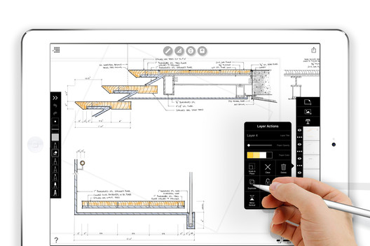
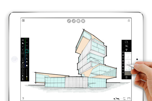
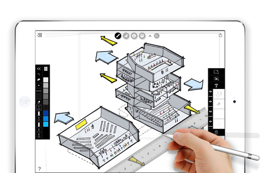
Developments in touchscreen technologies have opened up a new world of possibilities for architects and designers, and they continue to unfold. With the touchscreen and a good digital pencil, architects can now add sketching, drafting, hand-drawn commenting and mark-ups to their digital workflow—and yes, even bring our good friend trace paper into the mix. Software made for architectural drawing means that scales, rulers, furniture, entourage, notation stencils, and a wide range of pens are at your disposal at all times.

Sean Gallagher, director of sustainable design at Diller Scofidio + Renfro, is one of the architects leading this charge and testing its limits. Tools like Morpholio Trace, the iPad Pro, and Apple Pencil are literally changing the way Sean works on a daily basis, and he’s not alone. According to Sean, the simple fact is that the touchscreen software available today offers better precision and greater range than in the past, making it possible, once and for all, to clear his desk.
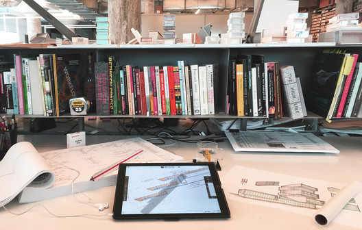
Sean’s love affair with the touchscreen began back in 2012. He realized that with the iPad he could instantly place photos and screenshots into a virtual notebook. “I’m a visual person, and can't think through an idea without collaging together sketches and images,” he says. “It's a process I did manually for decades with my sketchbook.” Now, he not only uses the iPad as a sketchbook but as his everything tool—enabling him to get rid of all other computers on his desk. “It has given me back the space to think, so now all I see in front of me is my library, sketch models and drawings; not keyboards, monitors, and mounds of paper.”

In the concept phase, Sean uses Morpholio Trace to sketch through ideas freely and with a full set of pens, pencils, brushes and markers at his fingertips, no matter where the idea strikes him. In the schematic design phase, those sketches start to take on scale as he goes back and forth with his team, fluidly drawing on top of models and diagrams. In Design Development, he finds himself constantly sketching details and marking up drawings with a red pen. Once the construction documents are issued, it is easy to continue markups as well as sketch on top of site photos to issue “SKs” and full job reports. While any team still relies on an array of software to bring a job to fruition, Sean’s role, like many, is about communicating ideas, and that can now be done digitally.
Several companies—Adobe, Autodesk, Concepts, and Morpholio—are making apps specifically for architects that make sketching on glass more or less similar to sketching with paper. The key difference is the ability to wield the computational advantages of greater precision, endless editability, duplicating, multiplying, layering, and so on, making the experience wildly more powerful than with paper. “It changed the static nature of my sketches, the process became less linear and more fluid, and I became more comfortable with sketching through ideas. The touchscreen interface has strengthened my love for sketching through ideas, and has really improved my craft.” The moment when Sean used the Apple Pencil for the first time on the larger iPad Pro touchscreen, he knew there was no going back and began reconsidering his daily workflow.

Since the widespread adoption of computer techniques such as CAD and BIM, the computer has come under fire for what many perceive as a tendency to alter the design process to its own ends; software is seen as a filter which restricts and shapes the architectural ideas available to architects. But contrary to popular wisdom, in a 2013 symposium at the Canadian Centre for Architecture, Tschumi argued that in his own Paperless Studios, “the computer did not generate a new language, it simply accelerated the existing concerns of a talented group of people.” Perhaps, having finally replicated and improved architecture’s most intuitive processes, the second coming of paperless architecture is at last living up to the dreams of its predecessor.
If you would like to try Morpholio Trace, you can find it here.


